Case study:
The Role of Book in Medieval Film Credits
Introduction
To immerse the spectator in the space of a picture set in the Middle Ages, the directors often turned to the image of a book. This imagery is not just visually eye-catching. It is a bridge connecting cinema to medieval storytelling traditions, a nod to the source material that lends the story a sense of historical grounding. Any movie begins with a script, and in the case of my subject, with a literary basis, whether it is legends, novels, fairy tales, or poems. Putting a book in the space of the film seemingly authorized it, made it more “veritable”, tied it to a material and semantic entity, i.e. a book.
This case study explores particular instances when a book as an object – whether its cover or pages – is used in the opening credits of movies from the database. How are these books presented? To what extent do they correlate with the time in which the action of the film unfolds, capturing the essence of the period? How is the association with the movie and the past shown in it made? These are the questions that this chapter sets out to answer.
Data analyzed
Will Straw in his article on film credits incorporated into the city’s architecture and skyline states that “[t]he credit sequences of classical and preclassical cinema will almost always model themselves on the printed page, the theatrical curtain, or the emblematic slide.”1 This assertion, however, is rather misleading in relation to the sample of films which are presented in this study. Among the 103 films released before 1964 that used medieval aesthetics in their titles, only 12 use the image of a book and turning pages – that is only ~12%. It cannot be claimed that this figure indicates a trend, but it is not worth ignoring the number of titles that follow the same pattern. Slightly, but not critically higher, is the percentage of such titles in movies with scripts that have a literary basis: eight out of 58 films, that is ~14%. By literary basis, it refers to a wide range of sources from epics and legends to newspaper comics.
In this selection, a marginally more general example is deliberately omitted. This is a separate category of title cards that appears to be hanging on the path to the representation of the book as a physical object, i.e. titles imitating parchment or scroll. There are enough examples of such films in the database used2, but this chapter’s main objective is to analyze a special kind of title sequence directly related to European book culture.
Hereafter, a list of relevant films. The title cards are presented in chronological order of film release in the Figures section of the chapter. For ease of search and unification purposes, titles are given in English as films were released in theaters in English-speaking countries.
- The Hunchback of Notre Dame, dir. W. Dieterle (1939)
- Adémaï in the Middle Ages, dir. J. de Marguenat (1935)
- The Devil’s Envoys, dir. M. Carné (1942)
- The Black Arrow, dir. G. Douglas (1948)
- The Iron Swordsman, dir. R. Fredda (1949)
- Wonderful Adventures of Guerrin Meschino, dir. P. Francisci (1952)
- The Monastery’s Hunter, dir. H. Reini (1953)
- The Saracen Blade, dir. W. Castle (1954)
- Joan of Arc at the Stake, dir. R. Rossellini (1954)
- The Pied Piper of Hamelin, dir. B. Windust (1957)
- The Saga of the Viking Women and Their Voyage to the Waters of the Great Sea Serpent, dir. R. Corman (1957)
- The Shepherd from Trutzberg, dir. E. von Borsody (1959)
The earliest available film with credits that imitate (or only attempt to) a book, came out in 1935, the latest (certainly strictly within the sample) in 1959. Two films each came out in 1954 and 1957, with the most movies – seven – released in the 1950s. 58% of the movies in this case study are shot in black and white, exactly seven out of 12. If all instances for a selection of all the films in the whole paper are factored into the statistics, the percentage drops to 38%, i.e. only 40 films out of 103 are black and white. Important to specify that it considers tinted black and white films to be color films by this criterion.
The list of films analyzed in this case study includes nine films whose screenplay is based on a literary source. In almost all instances, these are pieces written long after the events portrayed. One exception is The Iron Swordsman (1949) which is based on a short episode about the life of the Italian nobleman Ugolino della Gherardesca told in Dante’s Divine Comedy. A second example set shortly before the literary basis is Wonderful Adventures of Guerrin Meschino (1952) based on a chivalry romance from the 15th century.
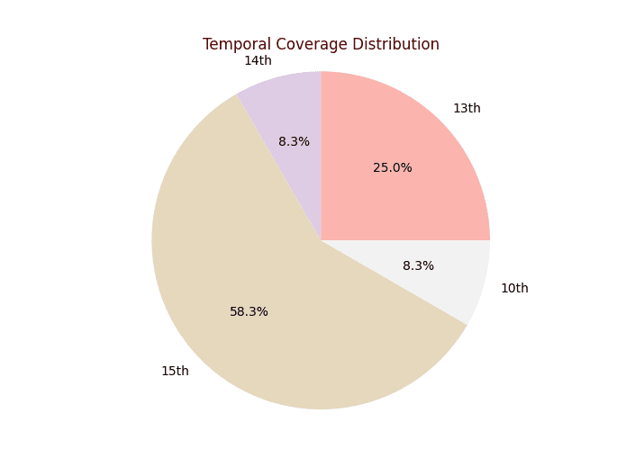
Seven of the dozen films are set in the 15th century, three examples are from the 13th century, and one described events from the 14th century. The strict chronological limits of another film are not specified in the story or in the sources that have arisen around that film and are currently available, but fall between the 8th and 10th centuries.
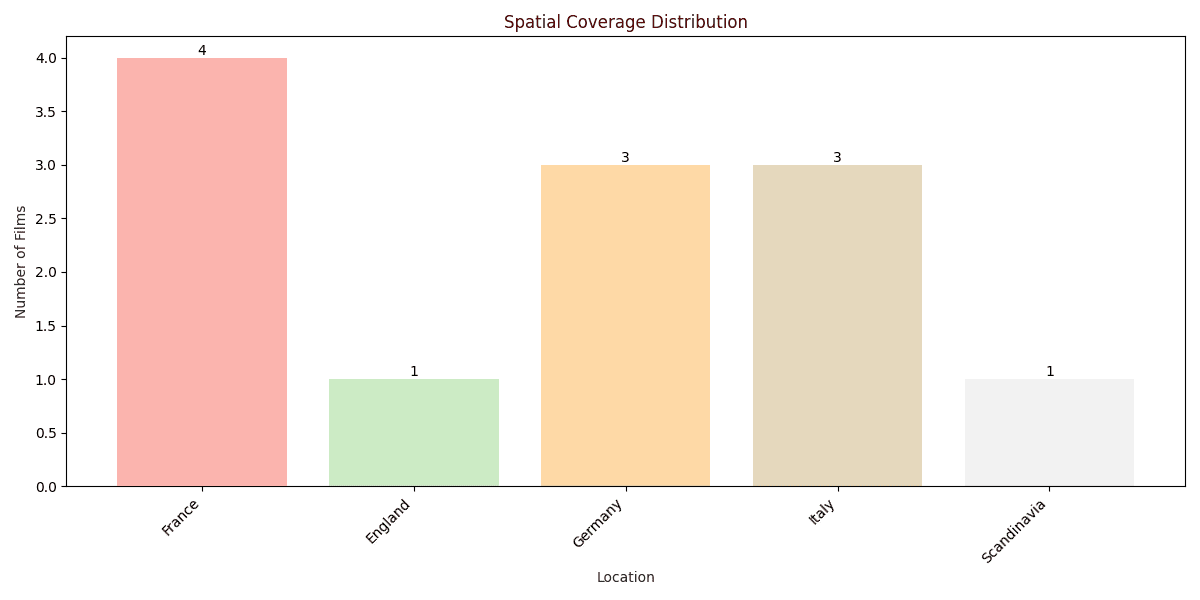
The locations of the films are quite predictable: most of the films are about France (four films), followed by Italy and Germany (three each), then England and Scandinavia (one each). This ratio is not unexpected. These countries were the leaders in film production, along with the United States, and their focus was concentrated on local history. In post-war Germany there was even a name for such a genre, Heimatfilm. It includes plot-driven, simple romantic movies that tell a straightforward story of love and friendship in a village setting. The perfect type for Medieval movies.
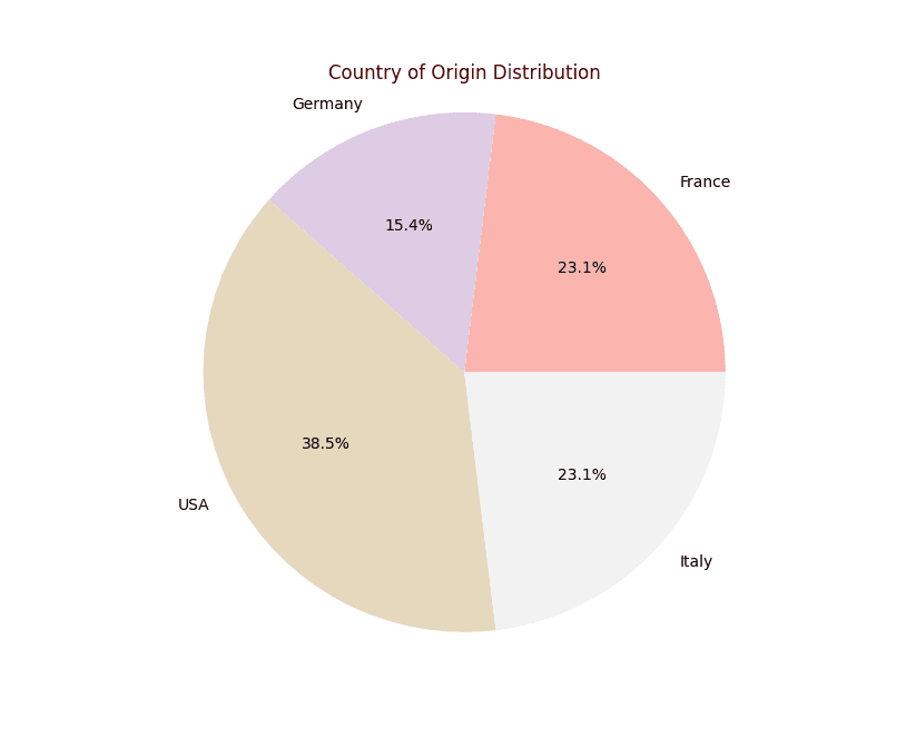
Regarding the country of production, the supremacy of the United States is undeniable and also unsurprising. The selection analyzed in this chapter consists of films released between 1935 and 1959. The shift towards advanced capitalism in the US film industry is dated by some film historians to the period between 1919 and 1935.3 Changes in film budgeting schemes, bankruptcies and mergers of production companies eventually led to the very form of the classic Hollywood style of shooting and production as we know it. The telling of universal stories as the main formal goal, the revisiting, reworking and adaptation of different narratives, the gravitation towards clear and unambiguous plots. David Bordwell consciously compares the movie studios of that era to monastic scriptoria.4 However, Hollywood had production facilities that medieval monks could never have dreamed of.
×
![]()
Analysis
As Richard Burt notes, the study of the so-called elements of “cinematic paratext,” which include opening credits, offers a fresh look at the relationship between medieval book culture and cinema as old and new channels of media communication5.
The first movie in the selection in which the opening credits are presented in the pages of a book is Adémaï in the Middle Ages (1935). The book here occupies the entire space of the frame, the spectators see nothing but the pages being turned. This “book” is nominal but there is no doubt that it was the “book” effect that the creators of the titles were trying to achieve. Some pages have small illustrations, made in a much more modern manner than the font. In the shot with the film title an image of a fortress is placed in the background, which does not correlate with the aesthetics of the font. Interestingly, when listing the supporting and third actors, the sheet turns into a scroll moving from bottom to top. After the shots with the names of the crew there is a montage effect of “flipping” rather than, as it was in the beginning, the obviously manual turning the pages.

The typeface used for the credits certainly refers to Gothic minuscule and to some intermediate variant between Gothic Textura Prescissa, littera formata (moderately formal grade)6.
The opening titles were painted by hand and the artist has undoubtedly introduced new artistic elements into it, relying on the traditional handwriting that is ubiquitous in European manuscripts, especially those found in what is now France and Spain, from the 12th to the 15th century. This font is the highest grade of the Gothic range of bookhands. The film is set in the late 1420s, so this stylization of the credits looks justified.
Chronologically following is The Hunchback of Notre Dame (1939), the US production. Frames of the opening credits are changed using a montage, and on the credits with the film crew becomes a scroll as in the previous example. The film is set in the late Middle Ages, but from the credits this dating is not clear. The serif font looks printed and stylistically refers rather to the books of the middle of the 19th century or, a little later, to the private press movement. On the other hand, the authors may have been inspired by the title pages of editions of Notre-Dame de Paris. However, no similar design was found among the various editions of Victor Hugo’s novel available online.

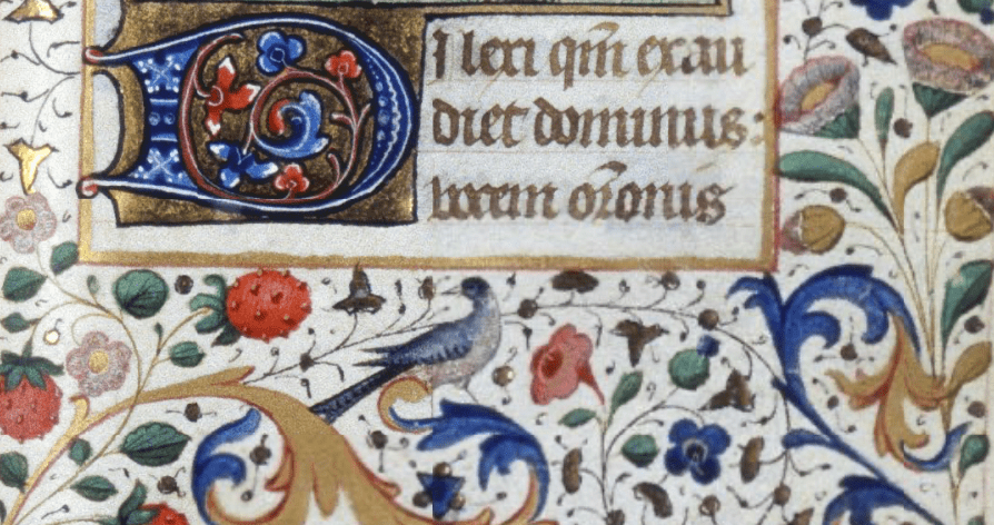
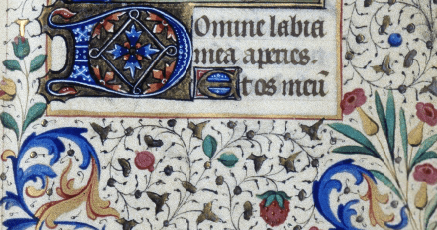
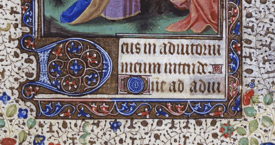
What stylistic features, adopted from manuscripts and printed books and reworked by artists, can be seen in the opening title pages? The title is in two colors. First, the ornamented capital letters “H”, “N”, and “D” grab the attention. They are an example of so-called fleuronée decoration, which is a special case of the broader term penflourishing or penwork7. The design extends above and below the letter space, the filigrée initials being the centerpiece. This type of initial decoration is one of the oldest and was common throughout the whole Middle Ages. The popularity was due to the use of only two colors, the relative ease of execution compared to more complex forms, and the guaranteed results. The second aesthetic element is the simple abstract ornamentation around the perimeter of the page margins. It does not resemble the typical ornaments found in manuscripts of the late Middle Ages, in which the events of the novel unfold8, but more resembles part of the bandeau ornaments that were usually located at the beginning of a chapter of printed books.
Therefore, the credits of The Hunchback of Notre Dame are a far from authentic stylization that does not refer to anything specific but a fine blend of different aesthetics, yet significantly modified.
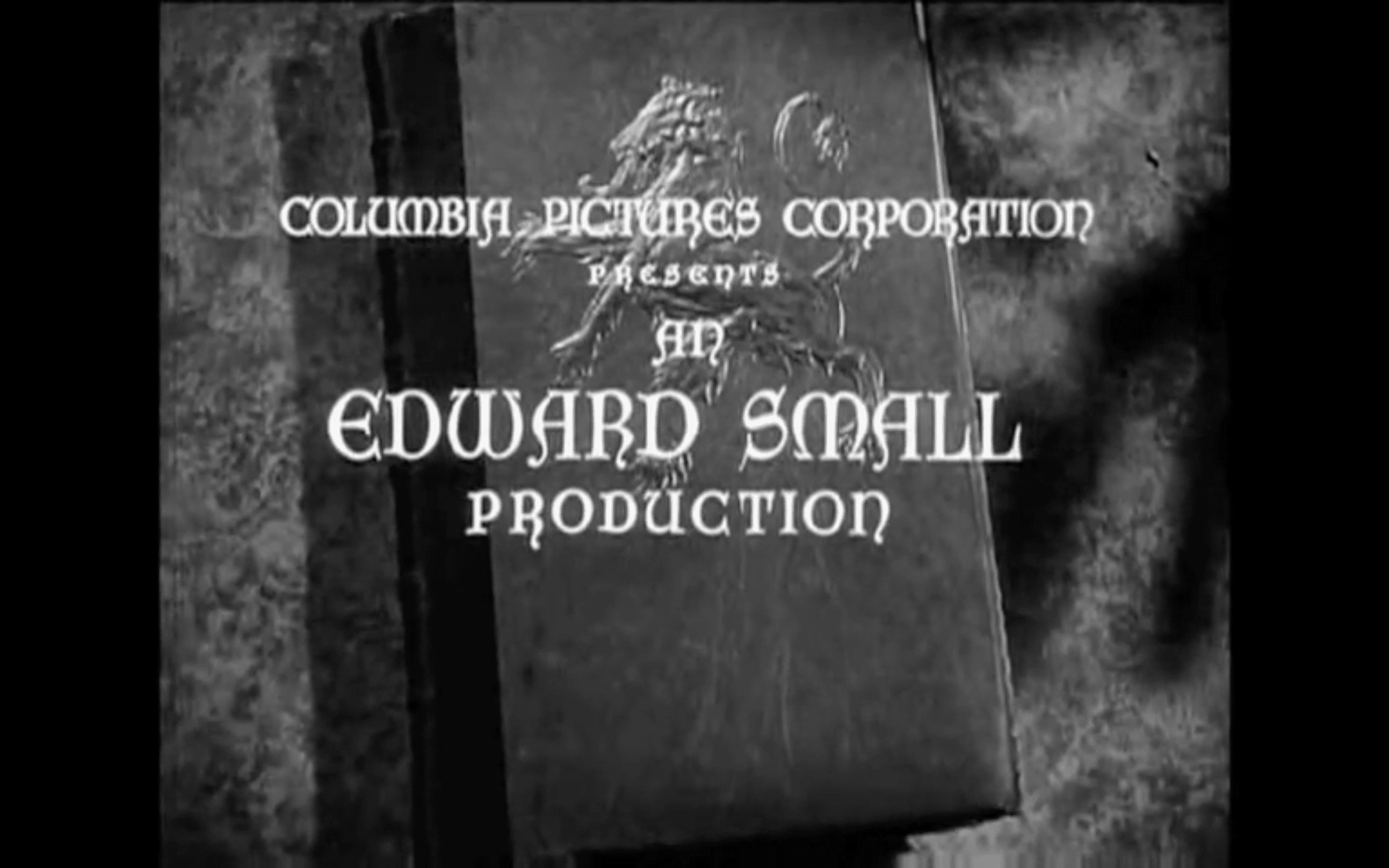
A more stylistically interesting example is the credits of The Devil’s Envoys (1942). This film often appears in papers analyzing medievalism and filmic incarnations of the Middle Ages9. The titles here are absolutely “spectatorial”, they hold the attention, make the viewer look at the book. The credits do not skimp on ornamentation and decoration.

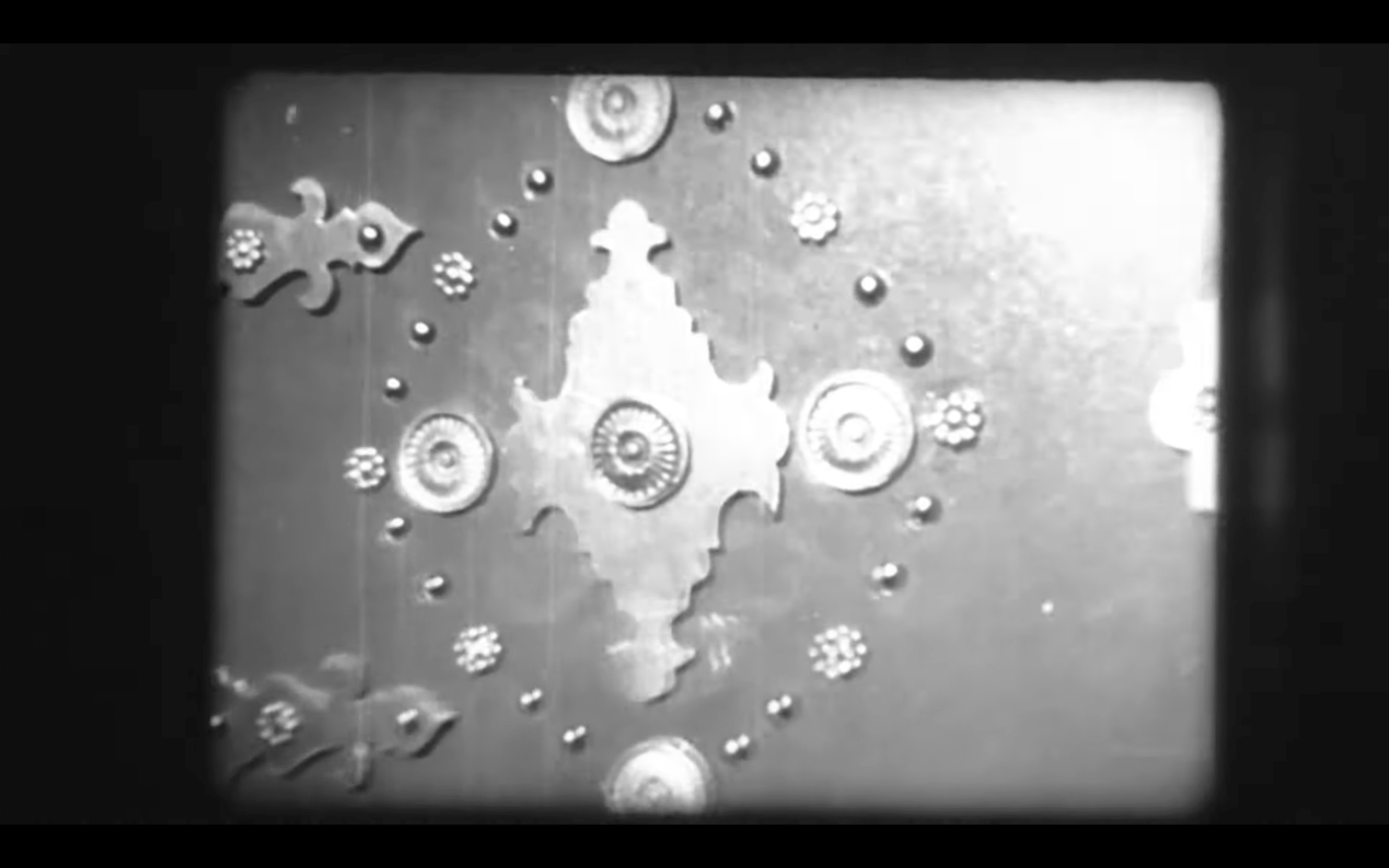
The action takes place in 1485 in France which is told to us in the introduction by a manuscript page, that is similar in its function to the intertitle of a silent movie. This page follows the opening credits, also written in the book. In the first shot, the spectator is presented with the lavishly embellished book cover. This elaborate plaque (or plate) is attached to the book-cover within which the caption pages are enclosed. The plaque comprises a central plate surrounded by ornaments made of gemstones and painted patterns. The central element is an appliquée image, a portrait of a woman, framed by a simple metal and ivory-like inner frame. The woman wears a high pointed hennin with a white veil. It is an extravagant choice of noble European women of the late Middle Ages, beginning in the 1430s. Such headdress was especially common in France, Burgundy and Flanders10.
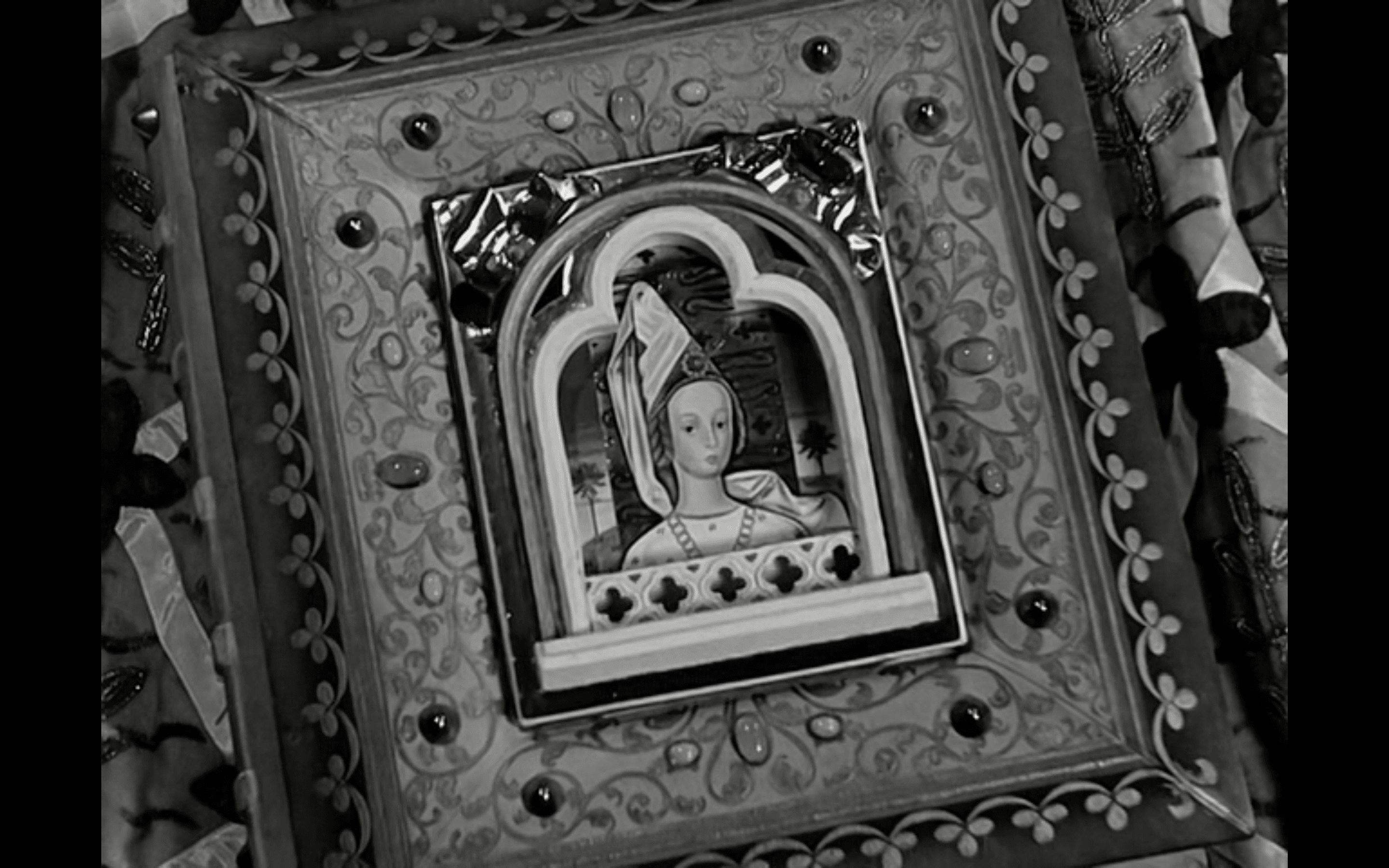
This cover design (with inlay, ivory, metal, and ornaments) often was characteristic of liturgical books. Examples of such design are found before and after the Middle Ages. Usually the central element was the figure of Jesus or the Crucifixion. However, there are examples of similar designs in non-liturgical literature as well11.
As with The Hunchback of Notre Dame the pages are turned, however in this movie the spectators see the hands that do it. This first-person filming accomplishes a more immersive experience of interacting with the opening credits. The title card is decorated with plane plant ornamentation around the perimeter of the page; the title itself includes decorated initials. The lettering is hand-drawn and stylistically influenced by the Gothic script system. Such inscriptions were used in books produced in monastic scriptorium.12 Similar letter designs are found in various manuscripts from the 15th century13, although it is obvious that such a script is not strictly tied to a particular period. The letter “V”, however, is out of the overall style: its drawing does not correspond to the common norms, besides, the letter “U” was usually used for initials.
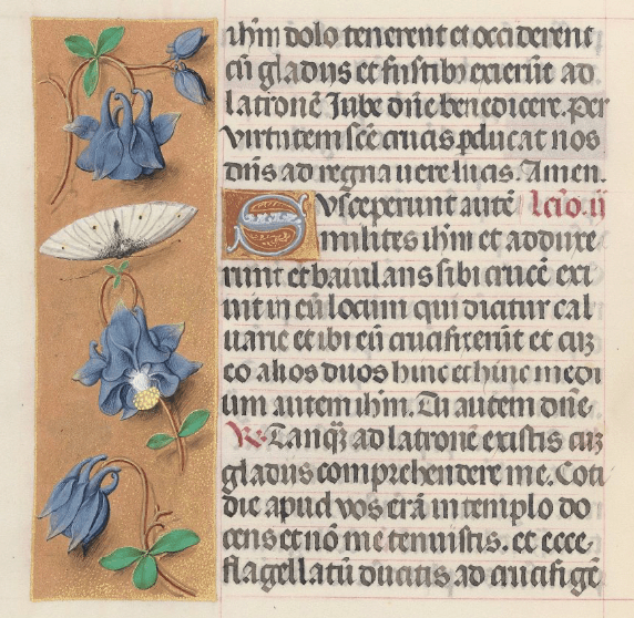
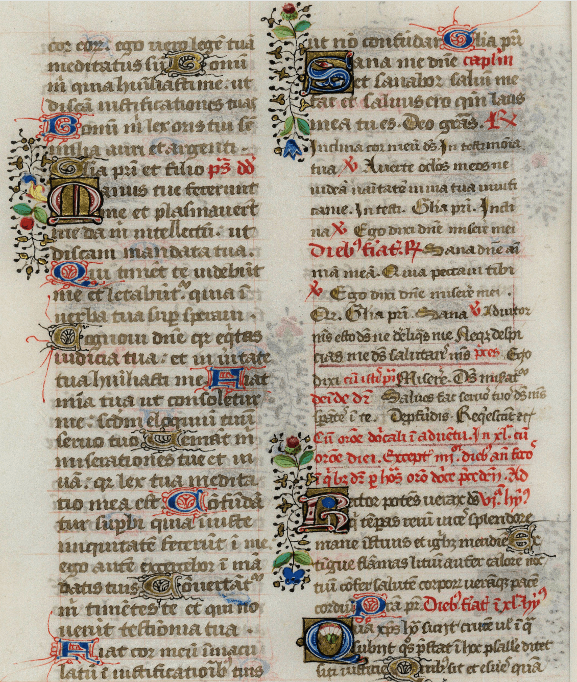
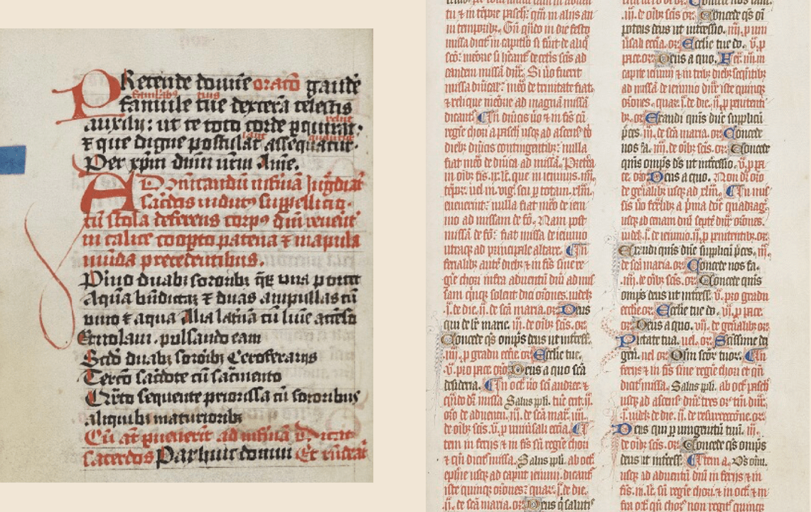
The floral ornamentation on this and the following pages, shown in the credits, refers to the design of books of hours14, lavishly decorated highly personalized prayer books, which were very common in the 13th–16th centuries. Such books for daily use usually consisted of a liturgical calendar, prayers, and psalms.
Overall, the credits for The Devil’s Envoys can be considered a curious example of working with a depicted era and skillfully integrating its characteristics into the space of the opening credits.
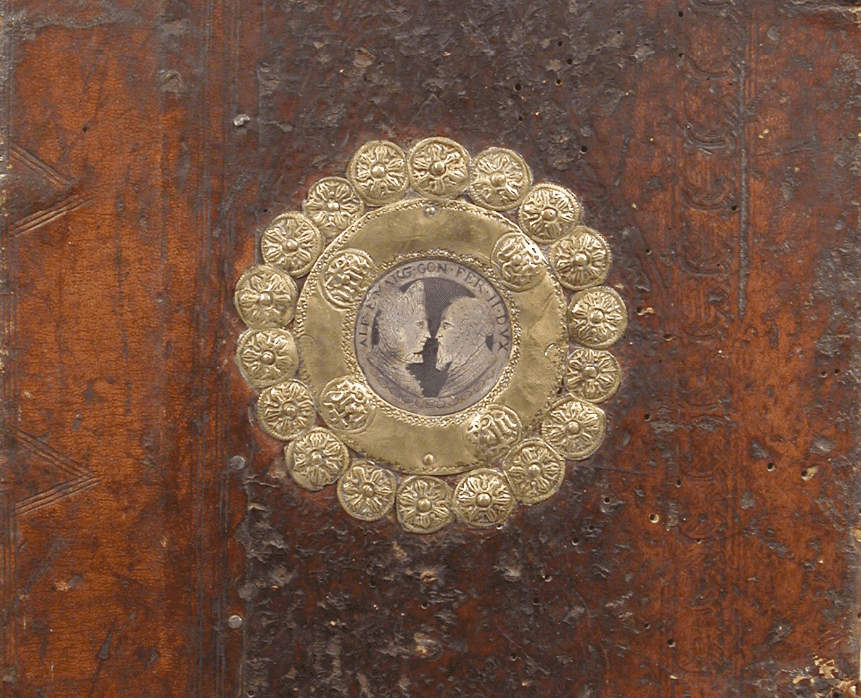
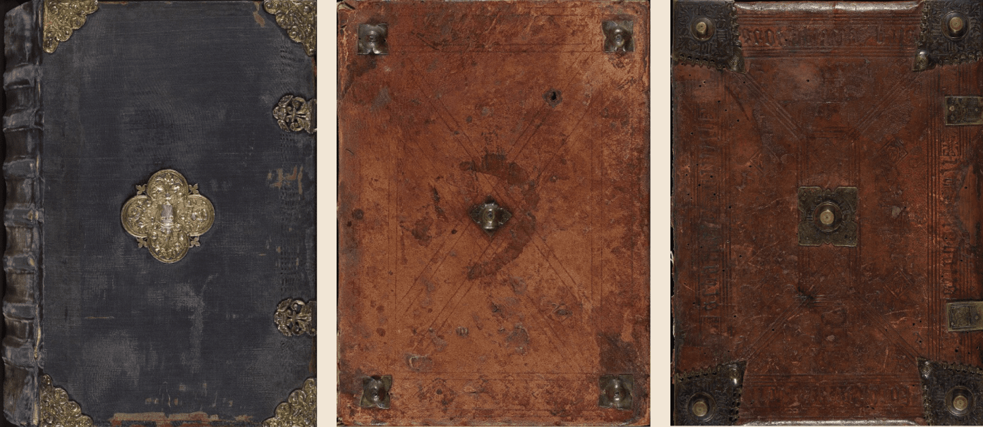
The opening sequence of The Black Arrow (1948) is organized similarly. Its design, however, from the very first frame casts doubt on the adherence to the 15th century aesthetics in which the events of the film took place. The book shown in the credits has the so-called half-binding (or demi-reliure) which did not emerge until the 19th century.
The central element of the cover is a super ex-libris with a coat of arms, so the book can be attributed to the armorial binding15 type which gained popularity after the Middle Ages.
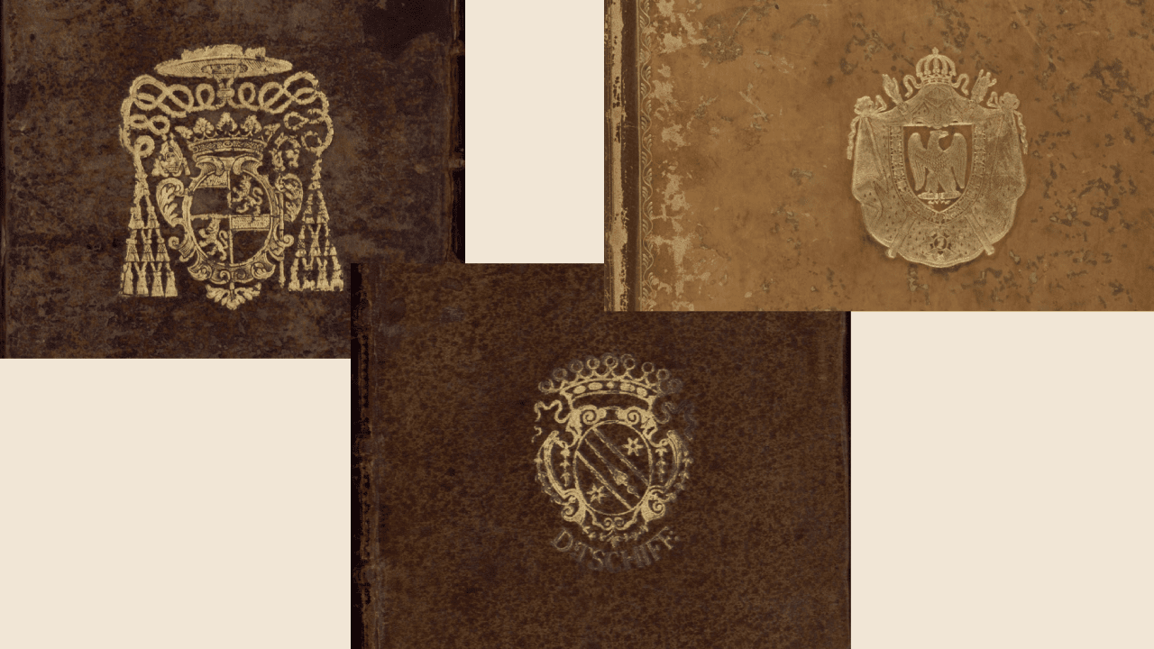
1. [Reliure aux armes de Vintimille du Luc, Charles-Gaspard-Guillaume de (1655-1746)]. BnF Catalogue général;
2. [Reliure aux armes de Tschiff, D]. BnF Catalogue général;
3. Légende des Trois Rois Mages. BnF Catalogue général.
In most cases such binding was non-original. The script on the pages is a liberal artistic interpretation of several written traditions16. The same kind of two-color decorated initials we have already seen in The Hunchback of Notre Dame but in this film there is also an unusual mixture of Gothic Quadrata and Rotunda, and Humanistic Cursive scripts17. The book is a variant interpretation of the past tradition.
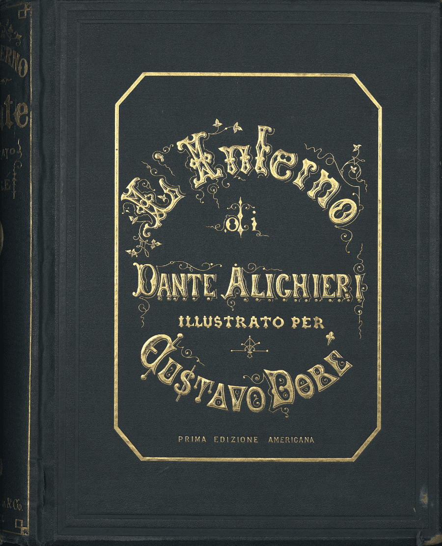
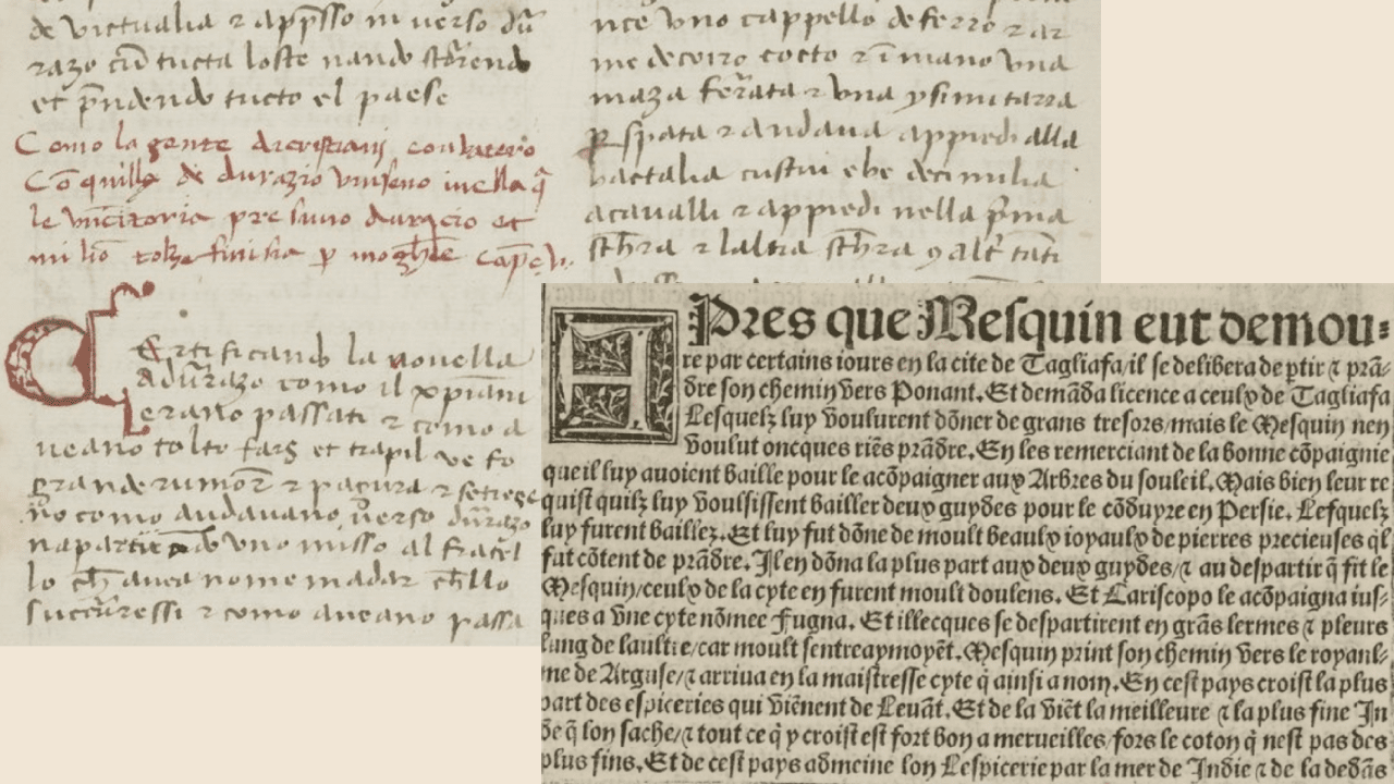
The title credits of The Iron Swordsman (1949), directly refer to one of the most famous editions of Dante Alighieri’s Divine Comedy. The movie tells the story of Ugolino della Gherardesca, an Italian nobleman placed by Dante in the second circle of hell for betraying his homeland. The movie opens with a shot of a 19th century book, on the title page of which is inscribed in Gothic script “Dante. La Divina Comedia.”

A hand turns the pages of the book, revealing Gustave Doré’s gravure for Canto 32 which depicts the devouring of archbishop Ruggieri by Ugolino. The image enlarges, filling the frame space, and a caption with the title appears. Interestingly, its font follows the design of the first American edition of the Divine Comedy, published in Italian in 186718. The appearance of the book and the layout of the pages do not coincide, but the font is undoubtedly transferred to the movie from the cover of this book.
Wonderful Adventures of Guerrin Meschino (1952) is another fantasy on the medieval book subject. In the second shot, right after the credits with the name of the production company, spectators see a typical medieval book cover19 – metal bosses, a copper roundel, and a massive book clasp20.
1. Oxford, Bodleian Library MS. Auct. D. inf. 2. 11;
2. Oxford, Bodleian Library MS. Add. A. 26;
3. Oxford, Bodleian Library MS. Broxb. 84.3.

An invisible hand is leafing through the pages, which are filled with artistic variations on medieval writing. In the script can be seen influences of English cursive (documentary and book script as well21) from the 14th century, Gothic cursive, and a simple pen flourishing ornament of capital letters. The movie is based on the Italian chivalric novel Il Guerrin Meschino, written in the early 15th century by Andrea da Barberino. The letters in the title credits are similar to one of the manuscript and first printed variants with Gothic cursive which are available in the BNF online library22.
1. da Barberino, Guerin meschino. “BnF Catalogue général”;
2. da Barberino, Le premier livre de Guerin Mesquin [...]. “BnF Catalogue général”.
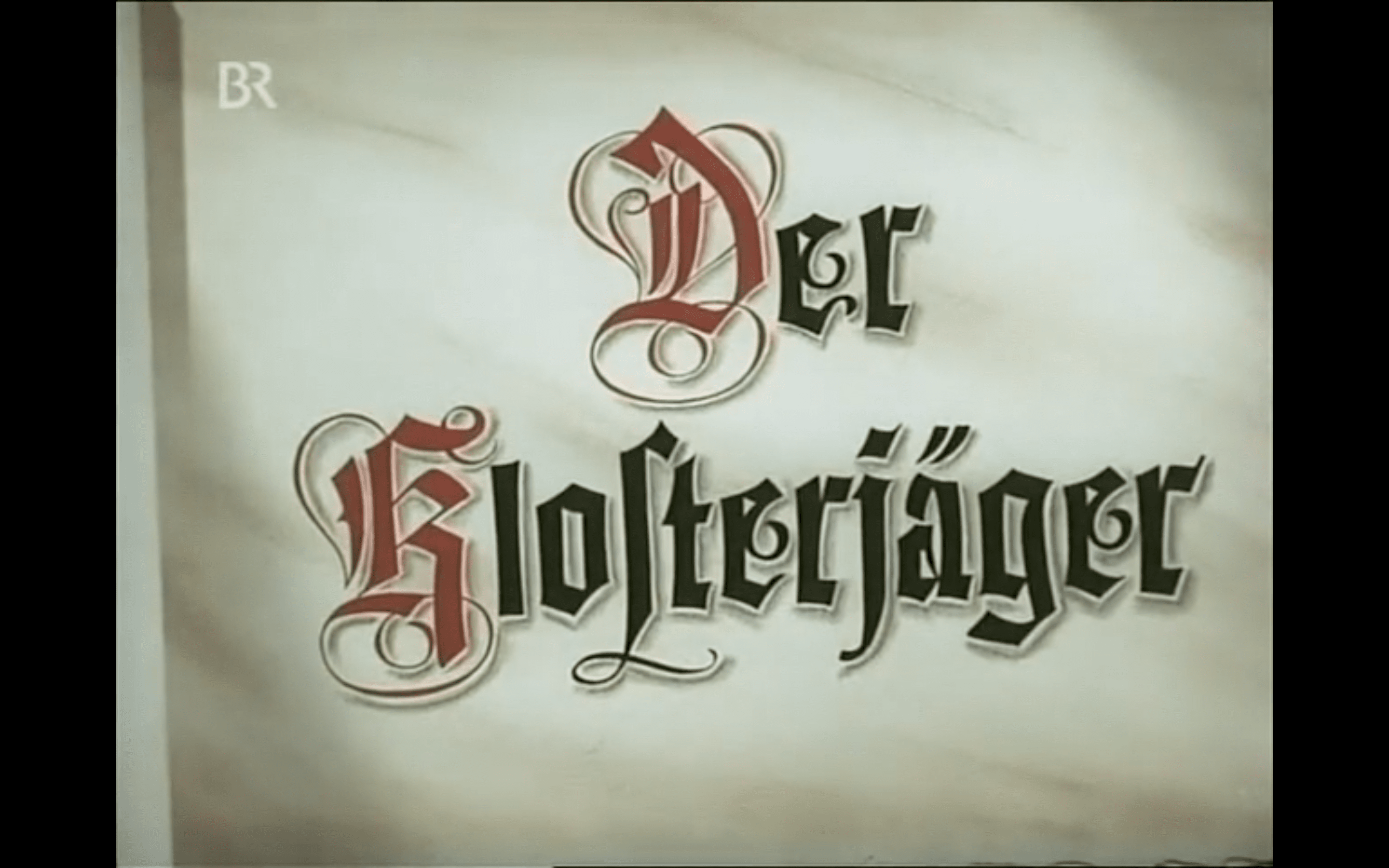
The first color film to use the book in its credits that is an instance of the database is The Monastery’s Hunter (1953). The movie is based on the 1893 novel of the same name by Ludwig Ganghofer. There are two shots with the title of the movie in the credits: the first one meets us on the cover of the book, the second is on a page after the credits with the names of the film crew.

Before our eyes is undoubtedly a book from the late 19th century. This is evidenced by the usual landscape orientation and the title directly on the cover. A resembling font is found in the first edition of the novel23.
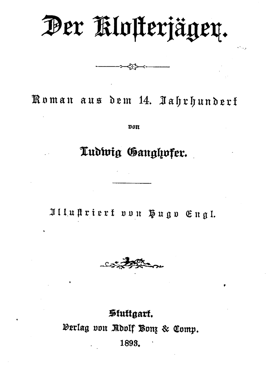
Both of these cases are artistic embodiments of the Fraktur typeface, which originated around the 1510s in Nuremberg and is the most recognizable typeface24 used for more than four centuries on the German territories25. Fraktur refers to strict Gothic script in its letterforms but it was already widespread in printed books. The authors of the title card to The Monastery’s Hunter have used it freely (take for example the unusual lettering of the letter “a”), while leaving recognizable features (wide lines, elongated letters). And again here we find decorative capital letters.
Fittingly, the trend with more modern books continues with The Saracen Blade (1954). The cover of the book, decorated with the title of the movie, looks contemporary to the time of the movie. This is evidenced by the book’s landscape orientation26, which is not typical of the Middle Ages, and the Bradel binding, which was not used until the 18th century. The cover looks comic, it promises bright fairytale adventures, although the plot of the movie cannot be called absolutely detached from the historical perspective. The title of the movie is made of different scripts: there are the letterforms we have already seen in The Iron Swordsman, which are used for capital letters, and a stricter Gothic variant, gravitating towards Textualis semi-quadrata. In this movie, more than in any of those previously reviewed, comes such a clumsy representation of the book titles.
Director Roberto Rossellini puts the title sequence in the eighth minute of Joan of Arc at the Stake (1954), right after the opening scene of the burning at the stake. This movie is filled with music, it introduces the audience from the very beginning, so the use of musical notation motifs in the title credits is justified and sets the tone for the narrative. The title shot is interesting for several reasons. Firstly, the use of letter colors, which has departed from the conventional use of color. Red and black (or dark brown) have been swapped.

During the Middle Ages red color was more often used for rubrication, the very term “rubric” came from the Latin meaning “red”. This color was most noticeable in the dark lines rows of the text and helped the reader to navigate the pages of the manuscript27. However, it was not uncommon for red to be used to highlight an entire piece of text rather than using just a capital letter28.
1. Oxford, Bodleian Library. MS. E. D. Clarke 29, fol. 17v;
2. Oxford, Christ Church MS 87, fol. 10r.
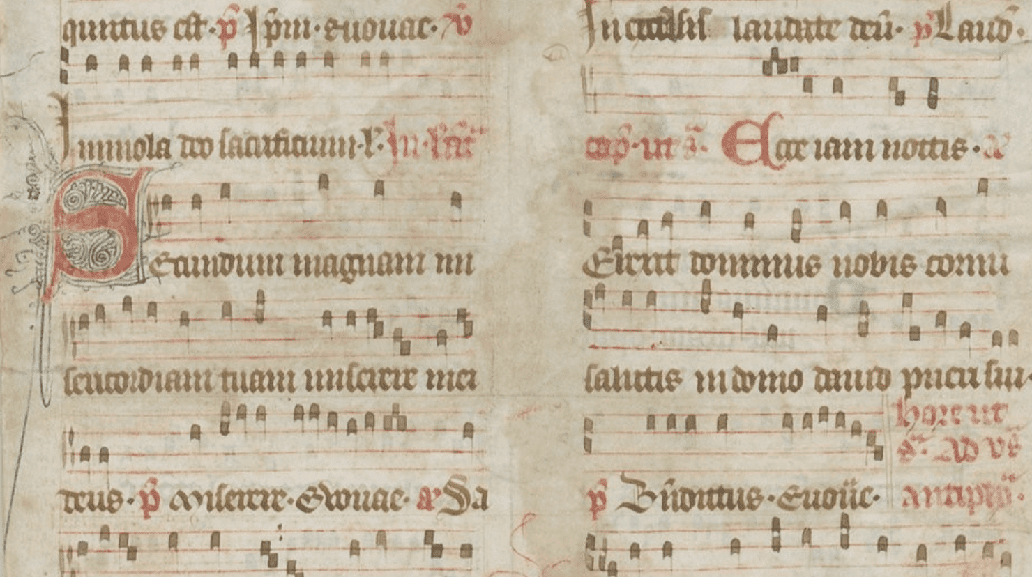
Other colors such as blue or gilt were used to headline text written in red. The title Joan of Arc at the Stake inverts this commonly used trop – the capital letters are set off in dark color, while the rest of the word is written in red. The typeface itself is an artistic fantasy. Secondly, the capital letters “J” and “S” are accompanied by a modest penwork flourishing that does not resemble the usual manuscript patterns. Third, it is curious to consider musical notation. Modern musical notation emerged in the 11th century in Italy, attributed to Guido d’Arezzo. Notation in the time of Joan of Arc looked different29; it did not become modern until the 17th century.
The second musical film in the selection, The Pied Piper of Hamelin (1957) appealing to an older Germanic legend about the salvation of the city, is treated loosely in the opening credits. The audience is greeted by a leather-bound book with the film’s title inscribed on the cover in gilded letters in late Gothic script. Inside, on the book’s pages, the font becomes even more modern in parts when the film crew is listed, and the credits are linked to the legendary story only by decorated capital letters in red and blue.

The Saga of the Viking Women and Their Voyage to the Waters of the Great Sea Serpent (1957) is distinguished not only by the length of its title, but also by its setting. The action takes place in Scandinavia between the 8th and 10th century. The framework is too broad but for a fantasy movie about battling a dragon-like sea serpent, that is not a huge assumption. The book is leather bound, and the centerpiece of the cover is a Viking ship, made either in gilt, like a super ex-libris, or metal. It is embedded in a metal ornamental frame around the perimeter of the cover. On the first page the audience is met by the film title written in a script too late for the events described. But that is what a saga is for, to be kept alive and transmitted to future generations. The title is typed in Gothic script, which is more of a late medieval typeface, as evidenced by the smoother, thinner lines.

The credits of The Shepherd from Trutzberg (1959) almost echo The Monastery’s Hunter. The same hypertrophied recognizable Fraktur, the same red capital letters. The cover is adorned with a modernized coat of arms, executed in four colors. The similarity of the titles of these two films is not accidental: their plots are close chronologically, and both films are based on the literary works of Ludwig Ganghofer.

Script Examples
-
[Antiphonaire de l’office]. “BnF Catalogue général,” http://catalogue.bnf.fr/ark:/12148/cb423061589.
-
[Manuale cantus]. “BnF Catalogue général,” http://catalogue.bnf.fr/ark:/12148/cb42694559n.
-
[Reliure aux armes de Tschiff, D]. “BnF Catalogue général,” http://catalogue.bnf.fr/ark:/12148/cb45932612g.
-
[Reliure aux armes de Vintimille du Luc, Charles-Gaspard-Guillaume de (1655 –1746)]. “BnF Catalogue général,” http://catalogue.bnf.fr/ark:/12148/cb45932591b.
-
Andrea da Barberino, Guerin meschino. “BnF Catalogue général,” http://archivesetmanuscrits.bnf.fr/ark:/12148/cc95677.
-
Antiphonary. 15th–16th century. The Metropolitan Museum of Art. https://jstor.org/stable/community.18468708.
-
Book of Hours (Horae Beatae Mariae Virginis). Hours of the Virgin: Lauds: Visitation. Trinity College, Watkinson Library (Hartford, Connecticut, USA), fol. 48r: https://jstor.org/stable/community.2842004.
-
Book of Hours (Horae Beatae Mariae Virginis). Hours of the Cross: Crucifixion. Trinity College, Watkinson Library (Hartford, Connecticut, USA), fol. 37r: https://jstor.org/stable/community.2841990.
-
Book of Hours (Horae Beatae Mariae Virginis). Office of the Dead: Death. Trinity College, Watkinson Library (Hartford, Connecticut, USA), fol. 97r: https://jstor.org/stable/community.2841999.
-
Book of Hours (Horae Beatae Mariae Virginis). Trinity College, Watkinson Library (Hartford, Connecticut, USA): https://jstor.org/stable/community.2841999.
-
Breviary Leaf, Illuminated Manuscript. Contains Psalms and Floral Illuminations, Seven Two-Line Illuminated Initials., 1475. https://jstor.org/stable/community.36109362.
-
Dante Alighieri, L’inferno Di Dante Alighieri, 1867, http://catalogue.bnf.fr/ark:/12148/cb44587684r.
-
Légende des Trois Rois Mages. “BnF Catalogue général,” http://archivesetmanuscrits.bnf.fr/ark:/12148/cc25784v.
-
Ludwig Ganghofer, Der Klosterjäger, 1893, https://www.google.fr/books/edition/Der_Klosterj%C3%A4ger/XOOq8sC7exoC.
-
Master of the First Prayerbook of Maximillian (Flemish, c. 1444–1519) (artist), and Associates (artist). Hours of Queen Isabella the Catholic, Queen of Spain: Fol. 54v. c. 1500. The Cleveland Museum of Art (Cleveland, Ohio, USA). https://jstor.org/stable/community.24609849.
-
Oxford, Balliol College MS 238C. https://digital.bodleian.ox.ac.uk/objects/48052f43-f533-4af4-8cec-d21f5960b8a6/.
-
Oxford, Bodleian Library MS. Add. A. 26. https://digital.bodleian.ox.ac.uk/objects/89ad56ee-1b64-4ab8-8605-b141b9016cad/.
-
Oxford, Bodleian Library MS. Auct. D. inf. 2. 11. https://digital.bodleian.ox.ac.uk/objects/c070934c-79ca-426c-a115-aee7d810579e/.
-
Oxford, Bodleian Library MS. Broxb. 84.3. https://digital.bodleian.ox.ac.uk/objects/807c6427-1682-4d80-8402-41cb92995a1a/.
-
Oxford, Bodleian Library MS. E. D. Clarke 29. https://digital.bodleian.ox.ac.uk/objects/be5da45e-7cad-413f-a5e6-fc2eceab64a6/.
-
Oxford, Christ Church MS 87. https://digital.bodleian.ox.ac.uk/objects/d6070820-9e6e-4443-bfd6-8c269b3306f0/.
-
Oxford, Christ Church Mus 996. https://digital.bodleian.ox.ac.uk/objects/4a70b801-eae5-4fac-b955-7a96cf4b5233/.
-
Rare Book Division, The New York Public Library. “The VVhole Booke Of Psalmes” New York Public Library Digital Collections. Accessed January 12, 2024. https://digitalcollections.nypl.org/items/a5c31f84-060c-ffc6-e040-e00a18060180.
***
-
Straw, “Letters of Introduction: Film Credits and Cityscapes,” July 1, 2010, 156.↩︎
-
For example: parchment in Du Guesclin (1949), The Men of Sherwood Forest (1954), or scroll in The Adventures of Marco Polo (1938), etc.↩︎
-
On the complex budgeting and production scheme of classic Hollywood movies: Bordwell, Staiger, and Thompson, The Classical Hollywood Cinema: Film Style & Mode of Production to 1960, 313.↩︎
-
Ibid. 3.↩︎
-
Burt, “Getting Schmedieval: Of Manuscript and Film Prologues, Paratexts, and Parodies,” 220.↩︎
-
For example: Book of Hours (Horae Beatae Mariae Virginis), Folio 97r: Office of the Dead: Death. Trinity College, Watkinson Library (Hartford, Connecticut, USA). https://jstor.org/stable/community.2841999.↩︎
-
Johnston, The Development of Penflourishing in Manuscripts Produced in England between 1180 and 1280, (PhD thesis, University of London, 2014), 25, 34, https://sas-space.sas.ac.uk/6260/↩︎
-
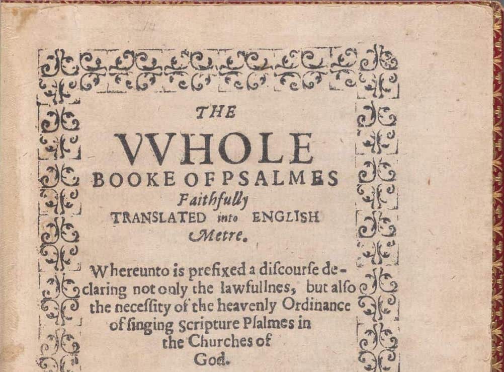
See similar ornament in: Rare Book Division, The New York Public Library. "The VVhole Booke Of Psalmes" New York Public Library Digital Collections. Accessed January 12, 2024. https://digitalcollections.nypl.org/items/a5c31f84-060c-ffc6-e040-e00a18060180.↩︎
-
See, for instance: Williams, “Medieval Movies,” The Yearbook of English Studies 20 (1990): 1–32. https://doi.org/10.2307/3507517; Tison, Pugh., Lynn, T., Ramey. (2007). Introduction: Filming the “other” Middle Ages. 1–12. https://doi.org/10.1057/9780230603561_1; Bildhauer, Filming the Middle Ages (London: Reaktion Books, 2011).↩︎
-
Vibbert, “Constructing the Headdresses of the Fourteenth and Fifteenth Centuries,” Known World Costume Symposium Proceedings (2005), 4–5.↩︎
-
Antiphonary. 15th–16th century. Antiphonary [89.27.2]. The Metropolitan Museum of Art. https://jstor.org/stable/community.18468708.↩︎
-
Brown, A Guide to Western Historical Scripts from Antiquity to 1600, 80.↩︎
-
See similar “L” and “S” in: Oxford, Balliol College MS 238C: https://digital.bodleian.ox.ac.uk/objects/48052f43-f533-4af4-8cec-d21f5960b8a6/, fol. 2r, fol.3r; for “S” also: Master of the First Prayerbook of Maximillian (Flemish, c. 1444–1519) (artist), and Associates (artist). Hours of Queen Isabella the Catholic, Queen of Spain: Fol. 54v. c. 1500. The Cleveland Museum of Art; Cleveland, Ohio, USA; Collection: MED – Manuscript Illuminations; Department: Medieval Art; Provenance: description: Unidentified first owner? (c. 1500); https://jstor.org/stable/community.24609849.↩︎
-
See examples of decoration in: Book of Hours (Horae Beatae Mariae Virginis). Office of the Dead: Death. Trinity College, Watkinson Library (Hartford, Connecticut, USA), fol. 97r: https://jstor.org/stable/community.2841999; Book of Hours (Horae Beatae Mariae Virginis)Hours of the Cross: Crucifixion. Trinity College, Watkinson Library (Hartford, Connecticut, USA), fol. 37r: https://jstor.org/stable/community.2841990; Book of Hours (Horae Beatae Mariae Virginis)Hours of the Virgin: Lauds: Visitation. Trinity College, Watkinson Library (Hartford, Connecticut, USA), fol. 48r: https://jstor.org/stable/community.2842004.↩︎
-
Examples of armorial binding can be found on Gallica and rare bookstores’ catalogs. See: [Reliure aux armes de Vintimille du Luc, Charles-Gaspard-Guillaume de (1655 -1746)]. “BnF Catalogue général,” http://catalogue.bnf.fr/ark:/12148/cb45932591b; [Reliure aux armes de Tschiff, D]. “BnF Catalogue général,” http://catalogue.bnf.fr/ark:/12148/cb45932612g; Légende des Trois Rois Mages. “BnF Catalogue général,” http://archivesetmanuscrits.bnf.fr/ark:/12148/cc25784v.↩︎
-
Similar letters “M”, “R”, and decorations of “A” and “B”: Breviary Leaf, Illuminated Manuscript. Contains Psalms and Floral Illuminations, Seven Two-Line Illuminated Initials., 1475. https://jstor.org/stable/community.36109362.↩︎
-
Brown, A Guide to Western Historical Scripts from Antiquity to 1600, 88, 133.↩︎
-
Alighieri, D. L’inferno Di Dante Alighieri, 1867, http://catalogue.bnf.fr/ark:/12148/cb44587684r.↩︎
-
Kwakkel, Books before Print, 2018, 24.↩︎
-
Some examples from the 15th century (as the film is settled in the same period): Oxford, Bodleian Library MS. Auct. D. inf. 2. 11: https://digital.bodleian.ox.ac.uk/objects/c070934c-79ca-426c-a115-aee7d810579e/; Oxford, Bodleian Library MS. Add. A. 26: https://digital.bodleian.ox.ac.uk/objects/89ad56ee-1b64-4ab8-8605-b141b9016cad/; Oxford, Bodleian Library MS. Broxb. 84.3: https://digital.bodleian.ox.ac.uk/objects/807c6427-1682-4d80-8402-41cb92995a1a/.↩︎
-
Brown, A Guide to Western Historical Scripts from Antiquity to 1600, 96–99.↩︎
-
da Barberino, Guerin meschino. “BnF Catalogue général,” http://archivesetmanuscrits.bnf.fr/ark:/12148/cc95677; da Barberino, Le premier livre de Guerin Mesquin [...]. “BnF Catalogue général,” https://gallica.bnf.fr/ark:/12148/bpt6k1510632p.↩︎
-
Ganghofer, Der Klosterjäger, 1893, https://www.google.fr/books/edition/Der_Klosterjäger/XOOq8sC7exoC↩︎
-
Burke, “Peter Behrens and the German Letter: Type Design and Architectural Lettering,” 21–22.↩︎
-
As noted: “Fraktur is a national form, not generally found outside Germany”. See: Dane, Blind Impressions: Methods and Mythologies in Book History, 14.↩︎
-
Certainly, it would be incorrect to claim that the layout of books in the Middle Ages was only portrait-oriented. For example, books with landscape orientation containing musical notation from 15th and 17th century: [Manuale cantus]. “BnF Catalogue général,” http://catalogue.bnf.fr/ark:/12148/cb42694559n.Oxford, Christ Church Mus 996: https://digital.bodleian.ox.ac.uk/objects/4a70b801-eae5-4fac-b955-7a96cf4b5233/.↩︎
-
Kwakkel, Books before Print, 2018, 16.↩︎
-
See the manuscripts from 15th century: Oxford, Bodleian Library MS. E. D. Clarke 29: https://digital.bodleian.ox.ac.uk/objects/be5da45e-7cad-413f-a5e6-fc2eceab64a6/, fol. 17v–21r; Oxford, Christ Church MS 87: https://digital.bodleian.ox.ac.uk/objects/d6070820-9e6e-4443-bfd6-8c269b3306f0/, fol. 8r–10r.↩︎
-
[Antiphonaire de l’office]. “BnF Catalogue général,” http://catalogue.bnf.fr/ark:/12148/cb423061589.↩︎