
Case study:
Robin Hood Films
Introduction
The image of a brave protagonist who takes money from the rich and gives it to the poor is firmly embedded in cinema. It is no exaggeration to say that Robin Hood has featured hundreds of times on the screen, both in episodes in other films and as the main character. Robin Hood’s literary history is also extensive, spanning several hundred centuries. In the earliest surviving ballads, recorded in the 1450s, he appears as an “anti-authoritarian trickster”1 who robbed corrupt church officials. However, unlike many other characters, he has several literary fathers – most famously Walter Scott, Thomas Love Peacock, Lord Tennyson, John Keats, and Alexandre Dumas. Romanticism brought several portraits of the legendary hero. It was only a matter of time before a cinematic incarnation appeared. Because of the abundance of sources on the hero’s adventures, Thomas Leitch suggests that the most authoritative are his film incarnations, which he wittily calls “copies of a nonexistent original”2. The numerous films about Robin Hood are fertile ground for research on the history of cinema and medievalism. What do the title cards of the films in the database reveal to the audience? What and how do they suggest about the historical period?
Data analyzed
The database contains eight films built around the figure of Robin Hood. The earliest is dated 1938, the latest 1960. Only one film in the selection, Tales of Robin Hood (1951), is black and white. Six of the films are from the United States, half of which were produced by Columbia Pictures, and only the last two were made in the United Kingdom. George Sherman directed two films, The Bandit of Sherwood Forest (1946) for Columbia Pictures, and Son of Robin Hood (1958). The screenplays of only two of the films have a literary basis – the 1941 novel “Son of Robin Hood” by Paul Castleton and the 1873 “The Prince of Thieves” by Alexandre Dumas3. The chronological framework of the narrative is blurred: the action takes place in the 12th and 13th centuries, to be understood both by implication (mention of the Crusades and King Richard I) and mentioned directly in the prologue. This framework is rooted in a single source, a brief biography of Robin Hood written by Scottish chronicler, John Major, in his 1521 “Historia Majoris Britanniae”4. There is no other evidence of the hero’s life during the reign of Richard the Lionheart or his brother John. John Aberth offers several candidates for the role of Robin Hood’s prototype, the most suitable of whom lived in the first half of the 14th century5.
Hereafter, a list of relevant films. The title cards are presented in chronological order of film release in the Figures section of the chapter. For ease of search and unification purposes, titles are given in English as films were released in theaters in English-speaking countries.
- The Adventures of Robin Hood, dir. M. Curtiz, W. Keighley (1938)
- The Bandit of Sherwood Forest, dir. H. Levin, G. Sherman (1946)
- The Prince of Thieves, dir. H. Bretherton (1948)
- Rogues of Sherwood Forest, dir. G. Douglas (1950)
- Tales of Robin Hood, dir. J. Tinling (1951)
- The Men of Sherwood Forest, dir. V. Guest (1954)
- Son of Robin Hood, dir. G. Sherman (1958)
- Sword of Sherwood Forest, dir. T. Fisher (1960)
Analysis
The legendary nature of the Robin Hood figure and many literary sources give filmmakers carte blanche to tell a story. The loose framing of the narrative includes the design of the credits. Therefore, all the examples in the database are loosely based on different medieval scripts from the early to the late periods. Thus, in The Adventures of Robin Hood (1938), one of the most famous and researched films on the subject, several clichés are found: initial ornamental letters painted in red, a parchment-shaped background with swords and coats of arms on which the credits change. The script chosen for the film’s title refers to several styles at once. The majuscule “T” alludes to the Blackletter script and incunables fonts. The uppercase “A”, “R”, and “H” are derived from different scripts, and the first two are more modern and together with the rest of the letters look closest to the sans-serif almost modern typefaces. While the “h” and “d” refer to manuscript traditions. Thus, some of the letterforms harken back to a later period. Lowercase “h” has a form similar to a variant of the 14th century Gothic rotunda, while “d”, written in a single stroke with a slant and lacking a strongly marked top and foot is similar to a Gothic textura of medium grade6.

×
![]()
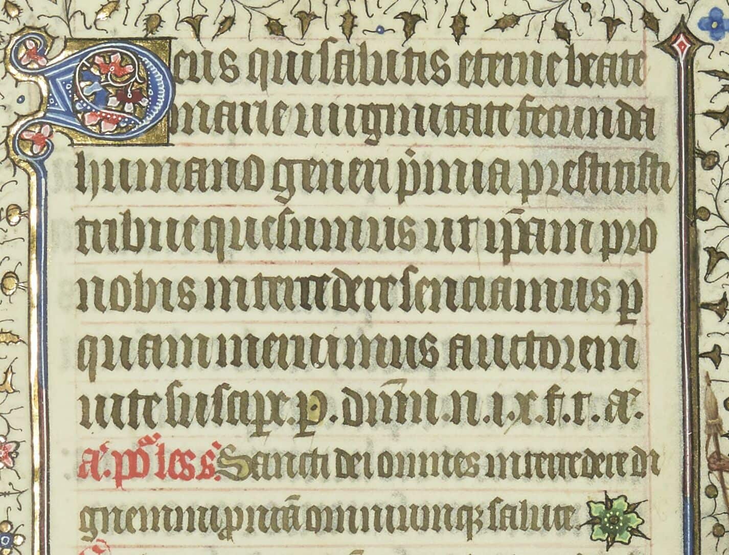
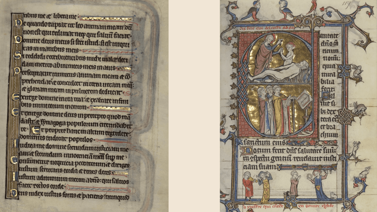
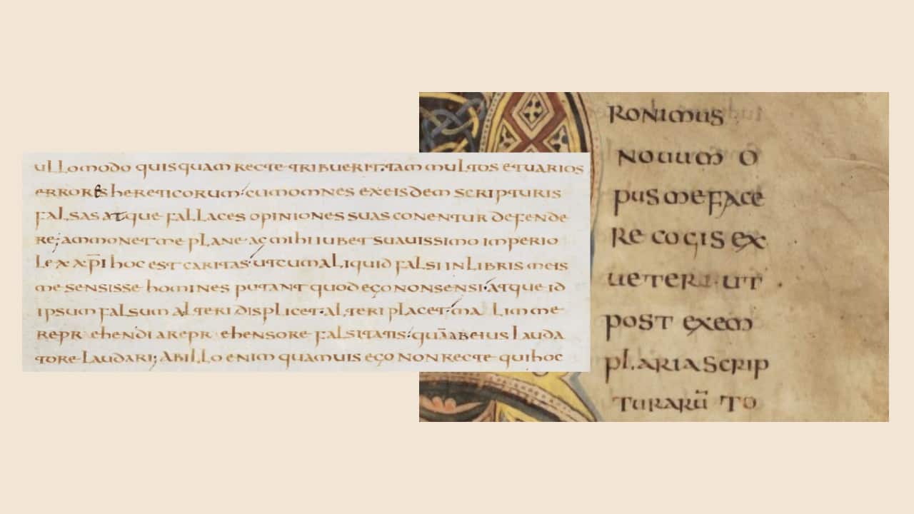
The title cards of the following three films share common elements. The Bandit of Sherwood Forest (1946), The Prince Of Thieves (1948), and Rogues Of Sherwood Forest (1950) tend towards the Gothic textura script. However, the letters in the first two cases are more elongated, narrow, and tall, while on the latter title cards most of the lettering is less transformed. Common to all examples is the drawing of several letters. Lowercase “s” has both loops closed and by its shape resembles an eight. Examples of this lettering are found in European manuscripts from the first half of the 14th century7. Such a form is very characteristic of the Gothic textura quadrata. The second common feature is the lettering of the letter “o” – this is an example of a very formally written Gothic prescissa8. The same description fits the group of Gothic letterforms common in Europe and England from the 12th to 15th centuries.


Left: Biblia sacra, dite Vulgate parisienne ou Bible de Paris, dite Bible de Robert de Billyng, “BnF Catalogue général,” Ms. 11935, fol. 557v.
Right: Book of Hours, Use of Sarum. Oxford, Bodleian Library MS. Laud Misc. 204, fol. 11v.
The title cards of Tales of Robin Hood (1951) also contain the formal “o”, which is also characteristic of the previous examples. The fonts used can be characterized as tall, narrow, compact in the horizontal dimension, even, and with diamond-shaped serifs. All uppercase letters have intricate serifs at the top and bottom, giving the text a decorative character. Such exaggerated serifs and drop-shaped ornaments at the ends of the strokes suggest the late Middle Ages or early Renaissance, when decoration was commonplace. The contrast between the thick vertical line and the thinner horizontal serifs and strokes is characteristic of the Blackletter script. The rest of the letters gravitate towards humanistic script9, a late successor to Gothic scripts.

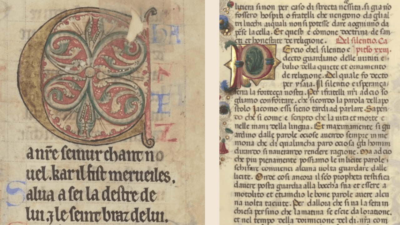
Son of Robin Hood (1958) offers a more modern take and interpretation of the same Gothic and Blackletter scripts with some stylistic choices that give it a cinematic flavor. The letters retain the angularity and upright accent of the Gothic scripts, but they are smoothed and stylised to appear more readable and dynamic, a characteristic feature of the 20th century revival of such style. The letters have a bold, dramatic look with sharp angles and high contrast. It is the most modern-looking title card, which, taking familiar and iconic letterforms as a basis, have gone very far in its interpretation. The choice of yellow ink for the letters is notable for several reasons. It cannot be omitted that the title card designer may have been inspired by the gilded letters. Gold was commonly used in illuminated manuscripts and to decorate initials. The level of lavishness usually depended on the importance of the text and the wealth of the institution or person who commissioned the manuscript. Gold decoration served several purposes at once: it affirmed devotion to God, served as a status symbol of the owner, and carried artistic value. Different shades of yellow ink were also used in the manuscript production both for illustrations and lettering10.

Left: Psautier-livre d’heures. Saint-Omer. Bibliothèque d'agglomération, Ms. 270, fol. 26.
Right: Psalterium. “BnF Catalogue général,” Latin 10435, fol. 117r.
As Derolez states, yellow ink was used primarily to highlight the opening letters. This color was especially common in the 15th century since it replaced more vivid red ink. This happened probably due to Italian influence on book culture. The highlighting technique itself became widespread from the 13th century onwards for better orientation on the page among the dense lines written in Gothic scripts. Also in the 12th century yellow ink was common for ornamenting minor initials11.
Left: Examples of using yellow ink for highlighting the first letters at the beginning of sentences, as well as for initials (with gold) from the late 15th century: Recueil sur la congrégation des Jésuats, fondée par le Bienheureux Jean Colombini, et approuvée par le pape Urbain V en 1365. “BnF Catalogue général”, Ms-855, fol. 28r.
The two remaining title cards, The Men of Sherwood Forest (1954) and Sword of Sherwood Forest (1960), are curious cases. In the first instance there are several features that should be addressed.

Thus, “t” in such a lettering begins to occur from about the 6th century in half uncial scripts12 and up to the already mentioned varieties of Gothic scripts. The uppercase “T” with swirls and roundness refers to similar forms of ornamented letters13.
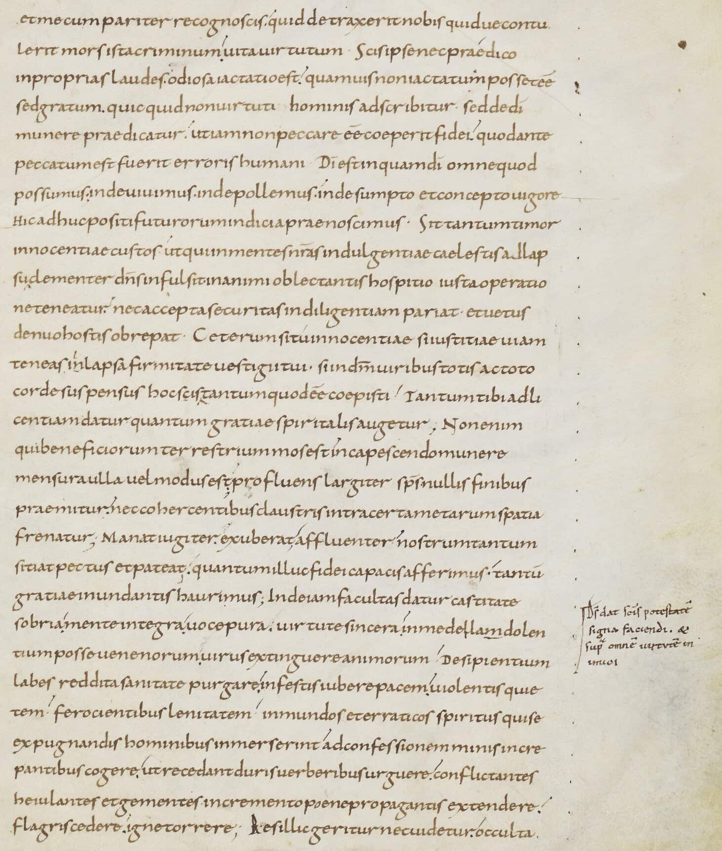
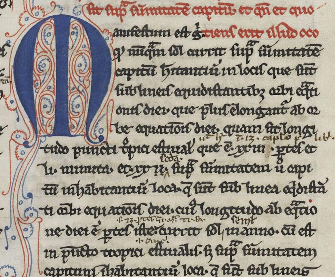
The initial “M” has exaggerated serifs and strokes that give it a decorative appearance. The letter is constructed so that the two vertical stems mirror each other, and there is a strong horizontal element at the bottom that holds together its form. Such symmetrical rounded lettering can be found in manuscripts written in Carolingian minuscule from as early as the 8th century14. The rounded lowercase “o” and “d” seem to be rooted in early miniscule scripts. While the lowercase “e”, “r”, “f”, “h”, “w”, and “s” are written out with reference to the later Gothic script tradition. An interesting feature is the use of quotation marks. They look like standart insular quotation marks. Evina Steinová observes “a sharp rise in the use of quotation marks in Latin manuscripts between the sixth and the ninth centuries”15.
Left: Augustine, De Trinitate. Oxford, Bodleian Library MS. Laud Misc. 126, fol. 6r.
Right: The four Latin Gospels. Bibliothèque de Genève. Ms. lat. 6, fol. 2r.
The script in Sword of Sherwood Forest (1960) also refers mainly to early examples of scripts such as uncial and minuscule. This typeface has characteristics that seem to combine medieval and fantasy design elements. It is interesting to note how much more fantasy-like it looks compared to the strict Blackletter-based scripts discussed above. Though similar lettering is also found in manuscripts.
Classification
Most of the examples discussed exploit various varieties of common Gothic scripts used in Europe in the 12th–15th centuries. This fits within the chronological framework of the emergence of the Robin Hood legends. However, there are examples of title cards relying on earlier scripts, which give the opening title sequence a more fantasy character. In addition, the title card of The Prince of Thieves (1948), which is based on Alexandre Dumas’s novel, skilfully uses the aesthetics of Medieval script and 19th century lettering. This blend gives an extra romantic flair to the opening credits.
In terms of credits typology, most films use the opening title sequence, but there are two curious examples of intros. In The Bandit of Sherwood Forest (1946), the film title card is literally a wooden plaque hanging from a tree branch. In The Prince of Thieves (1948) title card appears against the background of the unfolding action, the viewer sees two horsemen crossing the countryside. In most cases, however, the titles follow a formulaic conventional pattern: against a background of painted medieval attributes in the form of coats of arms, banners, parchment, and swords. As can be seen from examples of other films in the database, this is the safest and most fail-safe background for medieval film credits, especially in the swashbuckler genre.
Two title cards, The Adventures of Robin Hood (1938) and The Men of Sherwood Forest (1954) reference written culture directly by placing the film title on the background, which is reminiscent of parchment. Through this straightforward device, the title sequence achieves some form of establishing an early written tradition for the legends of Robin Hood, linking his figure to an ancient literary prototype rather than the hero of 19th century novels. The opening credits of Rogues of Sherwood Forest (1950) and Tales of Robin Hood (1951) are an example of the vernacular Hollywood language and, in broader sense, of the standard opening sequence for medieval films – frames are lavished with the Middle Ages items i.e. swords, shields, coats of arms, drapery. The plot of these films, though, centers around a hero alien to wealth and prestige. In Sword of Sherwood Forest (1960), despite the rather peculiar idea of the opening sequence, the design is limited to modern pencil sketches, although adapted illustrations in medieval style and with imitation of the then technique would have looked more appropriate.
Curiously, judging from this sample alone, it is not as if title card production technology has changed much. Sporadic instances of inventive title card representation can be found in early films, but over time, it is more noticeable how certain templates were developed and established.
Script Examples
-
Augustine, De Trinitate. Oxford, Bodleian Library MS. Laud Misc. 126, https://digital.bodleian.ox.ac.uk/objects/9fed4442-f4b6-439d-b359-41df38d9c9d4/
-
Biblia sacra, dite Vulgate parisienne ou Bible de Paris, dite Bible de Robert de Billyng, Ms. 11935, “BnF Catalogue général,” https://gallica.bnf.fr/ark:/12148/btv1b105097447
-
Book of Hours, Use of Sarum. Oxford, Bodleian Library MS. Laud Misc. 204, https://digital.bodleian.ox.ac.uk/objects/25ee025e-d635-48c2-a276-fc16d153d78c/
-
Commentary on St. John. Oxford, Bodleian Library MS. Canon. Pat. Lat. 159, https://digital.bodleian.ox.ac.uk/objects/43985bb0-0f8b-4439-a665-e467ea79a7d4/
-
Exposition des épîtres de saint Paul attribuée à Florus, II. “BnF Catalogue général,” Latin 11576: https://portail.biblissima.fr/fr/ark:/43093/mdata08dfe213fe9160a92415d9f5b84d509600fb99a0.
-
Horae ad usum Romanum, dites Heures de Jacques II de Châtillon-Dampierre et de Jeanne Flotte de Revel, sa femme. “BnF Catalogue général,” http://catalogue.bnf.fr/ark:/12148/cb423061589.
-
Letters and treatises. Oxford, Bodleian Library MS. Add. C. 15, https://digital.bodleian.ox.ac.uk/objects/fca37668-f648-4bf3-bac4-8dde86575833/
-
Psalterium. “BnF Catalogue général,” Latin 10435: https://gallica.bnf.fr/ark:/12148/btv1b105286177.
-
Psautier-livre d’heures. Saint-Omer. Bibliothèque d’agglomération, Ms. 270: https://portail.biblissima.fr/fr/ark:/43093/mdata2cf9d82a7c0bf795d1315623a5c2ddc1f99ea602.
-
Remembrance de Bertrand Du Guesclin. Angers, Bibliothèque municipale, Ms. 549, Biblissima, https://portail.biblissima.fr/fr/ark:/43093/mdata6f93ab7698c535f4307d5e2ca0b2e2e65e13cd36
-
The four Latin Gospels. Bibliothèque de Genève. Ms. lat. 6, https://www.e-codices.unifr.ch/en/searchresult/list/one/bge/lat0006#details
***
-
Thomas Leitch. “Adaptations without sources: the Adventures of Robin Hood”, Literature-Film Quarterly 36, no. 1 (2008), p. 22.↩︎
-
Ibid., p. 26.↩︎
-
The Bandit of Sherwood Forest (1948) and The Prince Of Thieves (1948) respectively.↩︎
-
John Aberth, A Knight at the Movies: Medieval History on Film (New York, NY: Routledge, 2003), p. 163.↩︎
-
A detailed study on the character’s history, the biographies of his possible prototypes, and the variety of films: John Aberth, A Knight at the Movies: Medieval History on Film (New York, NY: Routledge, 2003), pp. 162–210.↩︎
-
See, for instance: Horae ad usum Romanum, dites Heures de Jacques II de Châtillon-Dampierre et de Jeanne Flotte de Revel, sa femme. “BnF Catalogue général,” NAL 3231: https://gallica.bnf.fr/ark:/12148/btv1b100254479, fol. 136–139.↩︎
-
See: Biblia sacra, dite Vulgate parisienne ou Bible de Paris, dite Bible de Robert de Billyng, “BnF Catalogue général,” Ms. 11935: https://gallica.bnf.fr/ark:/12148/btv1b105097447, fol. 557v; Remembrance de Bertrand Du Guesclin. Angers, Bibliothèque municipale, Ms. 549: https://portail.biblissima.fr/fr/ark:/43093/mdata6f93ab7698c535f4307d5e2ca0b2e2e65e13cd36, fol. 4–5; an example from the 2nd quarter of the 15th century: Book of Hours, Use of Sarum. Oxford, Bodleian Library MS. Laud Misc. 204: https://digital.bodleian.ox.ac.uk/objects/25ee025e-d635-48c2-a276-fc16d153d78c/, fol. 11v.↩︎
-
Ibid.↩︎
-
E. g., Commentary on St. John. Oxford, Bodleian Library MS. Canon. Pat. Lat. 159: https://digital.bodleian.ox.ac.uk/objects/43985bb0-0f8b-4439-a665-e467ea79a7d4/, fol. 001r.↩︎
-
As examples of the use of gilded letters, here are the books of hours (a type of Christian book for lay people that presents an adapted monastic practice of praying at a specific time of day known as the canonical hours) from the 13th century not only with golden letters but yellow ink representation: Psautier-livre d’heures. Saint-Omer. Bibliothèque d’agglomération, Ms. 270: https://portail.biblissima.fr/fr/ark:/43093/mdata2cf9d82a7c0bf795d1315623a5c2ddc1f99ea602, fol. 26; Psalterium. “BnF Catalogue général,” Latin 10435: https://gallica.bnf.fr/ark:/12148/btv1b105286177, fol. 117r.↩︎
-
Albert Derolez, The Palaeography of Gothic Manuscript Books: From the Twelfth to the Early Sixteenth Century. Cambridge, U.K. ; New York: Cambridge University Press, 2003, pp. 40–41. An example of the use of yellow ink in minor initials from the late 12th century: Psalterium Latino-Gallicum. “BnF Catalogue général”, NAL 1670: https://gallica.bnf.fr/ark:/12148/btv1b10543447m, fol. 107r, . Examples of using yellow ink for highlighting the first letters at the beginning of sentences, as well as for initials (with gold) from the late 15th century: Recueil sur la congrégation des Jésuats, fondée par le Bienheureux Jean Colombini, et approuvée par le pape Urbain V en 1365. “BnF Catalogue général”, Ms-855: https://gallica.bnf.fr/ark:/12148/btv1b550134512, fol. 28 r.↩︎
-
Examples of lowercase “t” from the 9th century: Letters and treatises. Oxford, Bodleian Library MS. Add. C. 15: https://digital.bodleian.ox.ac.uk/objects/fca37668-f648-4bf3-bac4-8dde86575833/, fol. 3r.↩︎
-
See examples from the mid-12th century: Exposition des épîtres de saint Paul attribuée à Florus, II. “BnF Catalogue général,” Latin 11576: https://portail.biblissima.fr/fr/ark:/43093/mdata08dfe213fe9160a92415d9f5b84d509600fb99a0, fol. 5r.↩︎
-
Examples of similar but lowercase “M” from the 8th century: Augustine, De Trinitate. Oxford, Bodleian Library MS. Laud Misc. 126: https://digital.bodleian.ox.ac.uk/objects/9fed4442-f4b6-439d-b359-41df38d9c9d4/, fol. 6r; The four Latin Gospels. Bibliothèque de Genève. Ms. lat. 6: https://www.e-codices.unifr.ch/en/searchresult/list/one/bge/lat0006#details, fol. 2r. A similar form of initials is found in the 13th century script examples. For instance: Ptolomeus, Almagestum, transl. a Gerardo Cremonense. “BnF Catalogue général,” Latin 16200: https://gallica.bnf.fr/view3if/ga/ark:/12148/btv1b525094719, fol. 37.↩︎
-
Evina Steinová, “Technical Signs in Early Medieval Manuscripts Copied in Irish Minuscle”, in The Annotated Book in the Early Middle Ages, ed. Mariken Teeuwen and Irene Van Renswoude, vol. 38, Utrecht Studies in Medieval Literacy (Turnhout: Brepols Publishers, 2017), https://doi.org/10.1484/M.USML-EB.5.115017, p. 40.↩︎